
Form error messages should help a visitor finish a task. A message that says invalid input may announce a problem without explaining which field needs attention or what a correct answer looks like. For Kenyan websites and business portals, useful feedback can reduce unnecessary support questions and make everyday actions easier to complete. The goal is clear recovery, not merely a red border around a box.
This guide explains how to review form error messages with business owners, writers and developers. Explore Zama Web Experts and call 0725345345 to discuss your forms. Bring the actual enquiries, registrations or internal submissions that users struggle to complete so the review addresses real tasks.
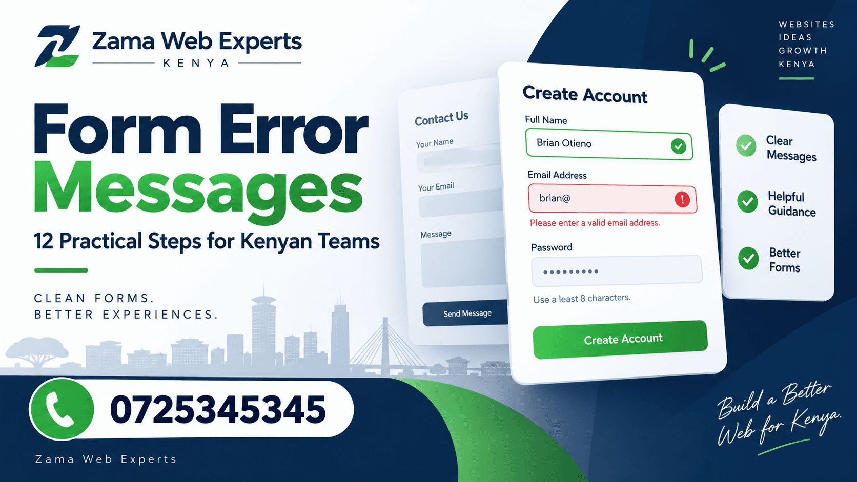
1. Start form error messages with the user’s task
Identify what the person is trying to do and why the field matters. A delivery instruction, preferred appointment time and account identifier serve different purposes. Their feedback should reflect those purposes rather than reuse one generic warning for every problem.
List the common reasons a submission might fail. Separate missing information, an unsuitable format, a business rule and a temporary service problem. Form error messages become more helpful when the team understands the cause before writing the sentence. Otherwise the same wording may ask a visitor to correct something that is not actually their mistake.
2. Match the message to the visible field label
Use the same name that appears beside the field. If the form says Collection date, an error about delivery_timestamp forces the visitor to translate an internal term. Keep technical identifiers in the support record where appropriate and use the customer’s language in the form.
For form error messages, specific wording helps people locate the problem. Enter a collection date is more actionable than complete required information when several fields are visible. Check the message in the complete form, because wording that looks clear in a spreadsheet may become ambiguous beside similar fields.
3. Explain the correction in plain language
Tell the user what needs to change without adding unnecessary detail. If a date format matters, provide a clear example. If a quantity has an agreed limit, state the relevant limit accurately. Avoid implying that a field is required when the business process allows it to be left blank.
The W3C guide to form notifications recommends clear feedback and practical instructions for resolving errors. Apply that principle to form error messages in your own task. The wording should help the person make a correction without needing to contact the team for an explanation.
4. Distinguish missing information from unsuitable information
An empty field and a completed field with the wrong format are different cases. A message saying enter your email address can be confusing when the visitor has already entered something. The second case needs feedback about the information supplied, not a claim that nothing was provided.
Test both cases when reviewing form error messages. Also consider spaces, pasted values and ordinary variations that your process should accept. Ask the developer which normalisation rules apply. Do not force users to remove harmless formatting unless the underlying requirement genuinely needs a particular representation.
5. Keep the tone respectful and factual
Avoid blame, jokes and dramatic language when someone is trying to finish a task. A correction should describe the issue, not suggest that the visitor was careless. Friendly wording can remain direct, especially when the form concerns an important request or a time-sensitive action.
Read form error messages aloud with the surrounding instructions. Check whether they sound like a helpful colleague explaining the next step. If the wording is long, remove anything that does not identify the issue or help resolve it. The shortest message is not always the clearest, but unnecessary explanation can hide the action.
6. Show feedback where it can be found
The visitor should be able to connect the message with the affected field. Long forms may also benefit from a summary that identifies multiple problems. Do not rely only on colour, because the meaning should remain understandable when a person cannot distinguish the visual cue.
Review the association between fields and form error messages with the developer and accessibility tester. Check the experience using a keyboard and appropriate assistive technology. A message that is visually obvious may still be difficult to discover when the person navigates the form in another way.
7. Choose the right moment for feedback
Some feedback is useful after a person finishes a field; other checks require submission or a response from the service. Avoid warning about an incomplete value while the visitor is still typing it normally. An email address briefly lacks its final characters during ordinary entry.
Agree the timing for each class of form error messages. Test a slow typist, a pasted value and someone moving back to correct an earlier field. The form should guide the task without repeatedly interrupting it or displaying a problem before the user has had a fair chance to complete the input.
8. Preserve information that does not need correction
When a submission fails, avoid making the visitor repeat unrelated work unnecessarily. Confirm which values should remain visible and which require special handling. A failed date check should not casually erase a long enquiry message that the customer has already written.
Review this behaviour alongside form error messages rather than treating it as a separate finishing detail. The message may be perfectly written, but the overall experience remains frustrating if correcting one field requires rebuilding the whole submission. Test the recovery journey from the user’s first attempt through successful completion.
9. Separate validation from service failures
If the system cannot complete the action because a service is unavailable, do not tell the visitor that their information is invalid. Explain the current outcome and the next supported step. Where submission status is uncertain, avoid encouraging repeated attempts that could create duplicate requests.
Form error messages should reflect what the system actually knows. Ask the technical team how it distinguishes rejected input, a failed action and an action whose outcome has not yet been confirmed. Business owners should approve the customer-facing response for each case before launch.
10. Keep browser and server checks consistent
Immediate browser feedback can help users, but it is not a substitute for checks on the receiving system. MDN’s form validation guide explains the distinction between client and server validation. Ask the developer to ensure that the accepted rules and resulting messages agree across the complete request.
Inconsistent form error messages can otherwise approve a value on one screen and reject it moments later with different wording. Test representative values through the full process. Keep the business rules documented so future changes do not update one part of the form while leaving another part behind.
11. Test with realistic examples and users
Create a small set of ordinary mistakes based on the actual form: a missing required value, an out-of-range quantity, an unavailable choice and a corrected resubmission. Ask someone unfamiliar with the implementation to complete the task. Observe where they hesitate and what they think the message means.
For a broader workflow, explore Zama’s portal development guide. Form error messages should be reviewed in the context of the complete journey, including login, navigation, submission and confirmation. A correct sentence cannot compensate for an unclear business process around it.
12. Maintain the messages when rules change
Assign an owner for wording and an owner for implementation. When a business rule changes, update the instructions, validation and messages together. An old example or limit can remain visible long after the underlying system has changed if nobody includes the text in the review.
Use an agreed support arrangement, such as Zama’s website maintenance service, to manage later fixes. Review recurring support questions about form error messages and use them to improve the form. Keep a short history of important changes so future reviewers understand the intended behaviour.
Worked example: a collection request
Imagine a shop’s collection form asks for an order reference and preferred date. A visitor leaves the date blank and submits. The form identifies Collection date and explains that a date is needed. The order reference remains available, so the visitor only corrects the missing information. If the chosen date is unavailable, a different message explains the supported next step.
Now imagine the service cannot confirm availability at that moment. The form should not reuse the unavailable-date message if the date itself has not been checked. This hypothetical example shows why form error messages need an accurate connection to the outcome, not just a set of polite phrases.
A message review worksheet
Record the form, field label, condition, current message, proposed wording, expected correction and owner. Add the point at which the message appears and how it is associated with the field. Keep test examples beside each rule so reviewers can reproduce the situation.
Ask a colleague to read only the visible form and message, without the internal notes. They should understand what happened and what to do next. If the wording needs a separate explanation, improve the message or the underlying instruction before approving it.
Questions teams often ask
Should every error be shown immediately? Choose timing according to the task and the information available. Feedback should help rather than interrupt normal entry before the visitor has finished.
Can one message cover every failure? Usually that hides important differences. Distinguish missing input, unsuitable values and service problems so the next action is accurate.
Does better wording solve every form issue? No. Review the fields, business rules, accessibility and recovery behaviour as well. Form error messages are part of the complete experience, not a replacement for fixing a broken workflow.
Related business platforms to explore
Different forms support different activities. Explore Vega POS for retail, Prim for salons and TAS for chama management. JAAT presents a digital mall, Dereva a driver marketplace and Saseni writing order management services.
Review each offering directly. These links do not imply that the platforms share accounts or use the same form rules. A useful review begins with the specific task and audience rather than copying messages from an unrelated service.
Review instructions before adding more warnings
Sometimes the best improvement is an earlier instruction that prevents confusion. If visitors repeatedly enter the wrong reference, explain where they can find the required reference beside the field. Form error messages should support clear instructions, not compensate indefinitely for a label that the audience does not understand.
Compare the example value with real accepted input. A misleading example can encourage the very mistake that the form later rejects. Keep examples appropriate to the audience and avoid displaying real customer details in public demonstration text.
During testing, ask people what they expected before they submitted the form. Their explanation can reveal a difference between the team’s terminology and the user’s understanding. Record that finding separately from a technical defect, because it may require a wording or process decision.
Form error messages should also remain consistent across related forms. If the same information is requested in two places, check whether the label, accepted format and correction guidance agree. Differences may be legitimate, but they should have a clear reason. Consistency helps a person reuse what they learned instead of starting again every time they open another screen.
Keep clear and fully approved wording examples with the form requirements so later writers and developers can follow the same approach. When a new field is added, review its normal instructions and failure cases together. This small habit helps prevent a clear form from gradually collecting inconsistent warnings as different people make changes.
Improve your forms with Zama
Bring one form that receives repeated support questions and several examples of the problems users report. Through Zama’s software development service, discuss the rules, wording and complete recovery journey together. Agree how the improved behaviour will be demonstrated and checked.
Use Zama’s contact page or call 0725345345. Start with a focused review of form error messages, test the changes with realistic examples and maintain the agreed wording as the business process evolves.